|
| Film poster |
Avatar, Directed by James Cameron made in 2009 is a sci fi film starring Sam Worthington as Jake Sully, Zoe Saldana as Neytiri and Sigourney Weaver as Dr. Grace Augustine. The film tells the story of how Jake Sully became an avatar as well as discovering the lifestyles of Pandora.
The film is pretty much Pocahontas in space. An ex-mariner confined in a wheel chair is whisked away to the world of Pandora to be his twin brother, Scientist Tom as a replacement. Jake later becomes a “middle man” to act as a representative as well as a communicator between the military and the Na’vi as the military wanted to mine Pandora’s underground which a valuable mineral which the Na’vi protects.
The film also focuses on the politics of humanity, mostly of technology fighting against Mother Nature as well as reflecting on the Vietnam and Iraq wars. “But, as much as technology aids and defines Avatar, it’s also a love letter to humanity and the glory of Mother Nature. The analogy with the Vietnam and Iraq wars is obvious, but Cameron, in siding with the insurgents (hardly an all-American move, but then again he is Canadian), is also asking fairly complex questions about what it means to be human.” (Hewitt, 2009)
 |
| The laboratory where the Avatars awaken |
The setting switches from sci fi military forces to exotic wildlife from time to time, all the designs of the exotic world of Pandora were purely made using advanced CGI which is apparently “the new step towards film making”. “Pandora and its luridly coloured inhabitants are beautifully designed, though none of this ever feels remotely real. But this was supposed to be the movie that changed the face of filmmaking forever” (Huddleston, 2003). There are lots of scientific props that were also seen in Alien like the avatar pods, which are fairly reminiscent to the hyper sleep pods in Aliens (1986) and also the robotic mecha warrior that also appears in both films.
 |
| The "hyper sleep" pods similarity in Avatar (left) and Aliens (right). |
The creatures in the film all have six legs, whereas the actors which the Na’vi appears as a seven foot tall creature were all made using advanced motion capture. “Na’vi civilisation is a mishmash of half-formed Hollywood ideas about the supposed superiority of ‘primitive’ cultures, tossing around buzzwords like ‘spirit’ and ‘energy’ without ever approaching a cohesive set of beliefs.” (Huddleston, 2003) At first, Cameron had the work made back in 1990 but decided to delay it later until the technology is so advanced that it could recreate his vision. The design for the Na’vi characters are based on a dream that his mother had as for the name “Avatar” was inspired from the Hindu gods but taking on a flesh form. “The Na’vis are intriguingly designed: Their faces, with their elongated almond eyes, resemble the faun in Guillermo del Toro’s “Pan’s Labyrinth,” although unlike that character, they also have shimmery skin and pale tiger stripes. They wear their hair in long braids that end in a cluster of tentacles with nerve endings; these anemones can be plugged into the tails of various forest creatures, forming a kind of natural circuit.” (Zacharek, 2009)
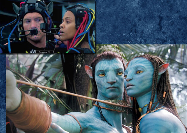 |
| Using advanced technology in making the Na'vi look |
List of Illustrations:
Davis (2010) Film Poster (online):
Wrenn, E (2009) The laboratory where the Avatars awaken (online):
Cameron, J (2009) The "hyper sleep" pods similarity in Avatar and Aliens. (online):
C-Ya, Darlene (2010) Using advanced technology in making the Na'vi look (online):
Bibliography:
Hewitt, C (2009) Avatar (online):
Huddleston, T (2003) Avatar (2009) (onilne):
Zacharek, S (2009) “Avatar”: Dances with aliens (online):


")