Here's version 2 of my animatic. I've made some slight changes to them either cutting or lengthening some shots.

Wednesday 29 February 2012
Animatic ver 2
Here's version 2 of my animatic. I've made some slight changes to them either cutting or lengthening some shots.
Unit 4: Story Telling- Deck chair prop designs

Female fish colour test 2

 |
| Based on colour designs 2, 3 & 4 |
Tuesday 28 February 2012
Unit 4: Story telling- female fish refinements & colour
Based on using designs from fish number 5, I've also experimented in expanding the size of the eyes based on design 1. I've also included a small colour sheet to go with them. I'm liking numbers 3 and 8 because of the "feminine" colours and also thinking about how they can contrast with the other fish characters colours.
|
| refinements and colour tests |
 |
| based on designs 3 and 8 |
Monday 27 February 2012
"A Fishy Tale" Animatic
Here's my first practice in making an animatic using the stills from my storyboard. I've a few shots in the animatic just to make things look more clearer. Apologies!! Its nearly 2 mins long but will try and figure out which shots needs to be cut out. I'm not really good with sound/music but feedback and opinions would be greatly appreciated. ^_^
Female Fish designs
Here are some fish designs for my female fish characters which the Bulky fish character dreams of being pampered by them. They're based on the betta crown, Japanese and Siamese fighting fish. For some inspiration suggested by Tutor Phil, I've also looked at the dancing fish scene from Fantasia. Looking at these helped me come up with these designs:

Sunday 26 February 2012
Unit 4: Story telling- Small fish colour test
Here are some colour test samples for my small fish character. I've also added the some different suits to the character to see would they "suit" them. ^_^ So far I am liking numbers 2 and 3 without suits and number 8 with the suit on as I feel they could be the opposite colour of the bulky fish.
 |
| colour test |
 |
| All suited up!! :D |
Unit 4: Story telling- small fish expressions
Here is my latest refinements for my small fish character. I've included some expressions that would be used in my animation.


Saturday 25 February 2012
Unit 4: Storyboards
Here are my story boards for my film, I had to split the boards in two as it was too big to fit in the scanner! So I've pieced them back together, there are also some shots that appear to be "out of place" or outside the main boards and while I was working on them, I've added these using sticky notes so apologies for that!! :S

 |
| Act 1 Scene1 and Act 2 Scene 2 in one board |

 |
| End of Scene 2 |
 |
| Scene 3 |
 |
| Scene 4 |
Friday 24 February 2012
Premiere Pro- Week 5
Today we did some practising on creating titles and credits along with green screening methods. We took some various clips, removed the green screen using the chroma key and added some titles and credits that would come useful to our films. It was fun!! :D
Thursday 23 February 2012
Unit 4: Storytelling- Small fish refinements
 |
| Small fish refinement |
Here I have made refinements to the small fish. Using the feedback, I've tried to mix in designs 4 and 10 together. I've taken number 10's body structure, a bit of its cheeks and mouth before adding number 4's eyes and refining them. Let me know what yous think!! ^_^
 |
| Designs 4 and 10 with the latest design. |
Unit 4: Storytelling- female fish

Here I have drawn several designs for the female fish that will appear in the Big fish's dreams. I've mostly looked at Shark's Tale, Finding Nemo and Tom and Jerry for the body structure. So far, I am liking number 11, 12 and 13 as their body are defined feminine.
Wednesday 22 February 2012
Life Drawing Class: Week 14
Today following last week's lesson with foreshortening, we also focused on the dynamics of the body. So to start the lesson we did some quick sketches of the body in various poses. Though the colours seems a bit faded, I was mostly concentrating in different ways in making it look dynamic.
Later as an experiment, we were given some charcoal to again create some dynamic rather than curves on the images. I was really pleased with the the second image on the right where the model is on one knee as the proportions look about right and it is given a sense that he's onto close ground.
 |
| Quick sketches |
Later as an experiment, we were given some charcoal to again create some dynamic rather than curves on the images. I was really pleased with the the second image on the right where the model is on one knee as the proportions look about right and it is given a sense that he's onto close ground.
 |
| charcoal sketches |
As part of another experiment, we were given some sticky sugar paper which using these with water, we have to shape out the body and draw out the outlines on top of them. I find this really fun and quite easy to blocking out shapes. Though trouble was that it took quite a lot of time to dry them before adding the charcoal on top of them especially when they need to be done within 30 mins! :S
 | |
Again to play on foreshortening, we had to work on the floor. We had a choice of either using the sticky paper or draw them out using pencil/charcoal. I chose to use the sticky paper and charcoal as they're really fun to work with! Though there wasn't enough time to complete the image because of the wet/dryness of the paper so I had to do what I can. I'm quite happy with the left foot but the right foot appears to be a bit distorted and smaller than the other foot. Still, it was fun working with a different type of media!
|
 |
| Sugar paper and charcoal |
Unit 4: Storytelling- Small fish silhouettes

Tuesday 21 February 2012
Unit 4: Storytelling- Character final concept designs?
Here are the chosen final designs for the big fish alongside with the small fish in the hotel scene. I’ve used colour designs 4 and 11 for the big fish and the small fish with the suit on. I’ve also added an image of it without the suit to see would it appear better with or without it- Feedback on this would be appreciated and loved!! ^_^
 |
| 1) Big fish based on colour test 11 |
 |
| 2) Big fish based on colour test 11 with small fish without suit |
 |
| 3) Big fish based on colour test 4 with small fish without suit |
 |
| 4) Big fish based on colour test 4 with small fish wearing suit |
Unit 4: Storytelling- Concept designs
Here are some concept designs for my fish hotel scenes. The first image is of the hotel taken from outside for the beginning of my animation. The second is where most of the action takes place with the big fish and small fish fighting for to be first. I’m really happy with the outcome of the first image as I feel that the blues and the rock textures worked well. But with the second image I was quite happy with it at first but realised that I’ve left the window. I’ve added it in only to have alot of the width image shrink to fit the 16:9 ratio.
 |
| Outside the hotel |
 |
| original without the window |
 |
| added window and before 16:9 ratio change |
 |
| after changing to 16:9 ratio |
Rear Window (1954) Review
 |
| Film poster |
The film tells the story of Jeff being confined to a wheelchair after being involved in a photography accident and so to pass time, he looks out of his apartment window which overlooks into neighboring apartments.
 |
| Jeff’s window overlooking the other apartments. |
To begin the film, visual story telling is used which the camera pans around the characters living around the apartments doing their own activities outside the hot weather. The camera then pans to Jeff’s face before panning around his room and pictures before and after his accident until it gets to his leg cast and him confined in a wheel chair. However, it is noticeable that the camera never moves away from Jeff’s apartment but is aligned to Jeff’s point of view as mentioned by reviewer, CPea from Timeout London- Film Reviews, “the camera never strays from inside Stewart's apartment, and every shot is closely aligned with his point of view.”(Cpea, 2008). However match on match editing is frequently seen between Jeff and mostly of the outside apartments.
 |
| Thorwald using a knife to “kill” his wife? |
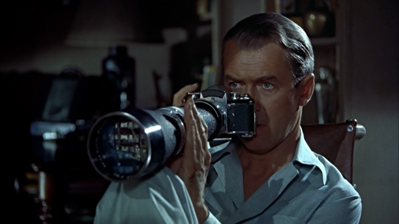 |
| Jeff using his photography camera |
MovieGurur (2010) Film Poster (online):
http://www.movieposterdb.com/poster/a3d2fd71 - (accessed on 15/02/2012)
Malone, Sarah (2010) Jeff’s window overlooking the other apartments (online):
http://brightwalldarkroom.tumblr.com/post/434949525/rear-window-1954- (accessed on 15/02/2012)
James (2011) Thorwald using a knife to “kill” his wife? (online):
http://underthegunreview.net/2011/12/07/reasonable-remakes-rear-window/- (accessed on 15/02/2012)
aceblack1965 (2010) Jeff using his photography camera (online):
http://www.theaceblackblog.com/2012/01/movie-review-rear-window-1954.html- (accessed on 15/02/2012)
Bibliography:
CPea (2008) Rear Window (1954) (online):
http://www.timeout.com/film/reviews/76472/rear_window.html - (accessed on 15/02/2012)
Taylor, Charles (2000) Rear Window (online):
http://www.salon.com/2000/01/21/rear_window/ - (accessed on 15/02/2012)
Canby, Vincent (1983) Rear Window- Still a Joy (online):
http://www.nytimes.com/library/film/100983hitch-window-reflect.html- (accessed on 15/02/2012)
Monday 20 February 2012
Unit 4: Big fish Colour tests

Sunday 19 February 2012
Unit 4: Big fish Development refinement

 |
| developments from figure 4 |
Saturday 18 February 2012
Unit 4: Big fish Development 2
Using the basis of design 6, I've tried to create the arrogant appearence by either changing the eyes and jaws as well as changing the body posture by looking at Preston Blair's Advanced Animation. Feedback would be much loved!! ^_^

 |
| Based on design 6 |
Premiere Pro: editing weeks 1-3
Introduction into editing, transitions and effects
(experimenting with effects and transitions)
Experimenting with editing
Editing practice
Friday 17 February 2012
Unit 4: Bulky fish silhouettes 2

Unit 4: Big fish influences 2
Looking more closely at the body structure and facial expressions of various cartoon fish mostly from Tom and Jerry cartoons.

Thursday 16 February 2012

Unit 4: Story-telling: Screenplay draft 3
Here is draft 3 of my screenplay, I'va made changes to the hotel name and the elevator, and the ending of the story. I've also added a bit of an introduciton to the story with an ouside view of the hotel. I'm still deciding over what to have in the Big fish vs Little Fish sequence.
Screenplay draft 3
Screenplay draft 3
Unit 4: Storytelling- Big Fish vs Little Fish
Taking on the feedback from TutorPhil about looking at physical humour, pratfalls and farce elements. I've taken some ideas after watching Taz Mania, Tweety and Sylvester, Wile E. Coyote and RoadRunner, Bugs Bunny and Tom and Jerry cartoons for this.
Big fish vs Little fish ideas
Big fish vs Little fish ideas
Wednesday 15 February 2012
Maya: Pan, Crane, Roll, Dolly, Pitch shots and Car scene
Pan Shot
Crane Shot
Roll Shot
Dolly Shot
Pitch Shot
Car Scene Sequence
Car Camera Shake Sequence
Tuesday 14 February 2012
Life Drawing Class: week 13
 |
| Quick 60 sec sketches |

Next we did an hour's draw of what we think expression is in art form. For me, I thought of cubist or shapes style like Picasso's. Whilst doing this, we also had to focus on perspectives so we either could sit or stand to draw. I chose to sit down and drew from a low level. I'm happy with the result of this image as when drawing the image I can make out the shapes of the body.

Lastly we did another drawing of the same brief. Again I chose to sit down and draw from a low level. This time, I think that I should exaggerate the shapes a bit more as when displaying my previous image, from a distance the shapes disappeared. The left leg proved quite a challenge to draw due to its shape and angle, I've also figured that the position of the leg to the chin appears to form a line. This helped me into getting the proportions and angles right as well as knowing where the perception is. I'm very happy with the result.
Unit 4: Storytelling- First set of storyboards

Unit 4: Storytelling- Scene development

Unit 4: Possible concept art?

Unit 4: Storytelling- Big fish development

Unit 4: Storytelling- small fish development

I've managed to develop the small fish character. At first, I liked fig 1 but seemed that it looked too "froggy" so option 2 seemed ideal especially with the black jacket. Underneath those are a few character expressions. More will be up soon!!
Subscribe to:
Posts (Atom)