Friday 16 December 2011

Unit 3: Environment Photoshop thumbs

Just a few more thumbs working in progress, playing around the idea of long distances and parts of the walls being distorted. I feel that the clown scene looks a bit repetitive and the use of the clown seems a bit over used.


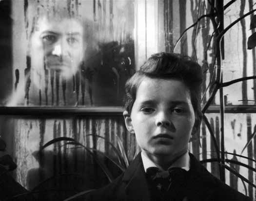
This image is experiementing with the idea where parts of the walls are in different angles.


This image is pretty much "moden technology" looking back at the old, through a "time portal". The outside of the frame is sci-fi like with the insides set in victorian era, with stuffed animals on the walls. I've also included an image of an old figure only zombie-fied giving this creepish look. Still more thumbs to come!! 

Maya- fluffs, furs and santa hat


Today we did some adding furs and some experiments on light and self shading, blending controlling density and baldness.
 
Adding furs, light shades and blends

 
Light shades


Controlling Density and Baldness


Lastly, we added fur to the santa hat!! ^v^ Moving around the lighting and fixing the lengths of the fur.

Before final settings: "Its so Fluffy I'm gonna Die!!" (Despicable Me, 2010)
 
After: What it should look like

Thursday 15 December 2011

Unit 3: Environment- 2 more photoshop thumbnails


Just did some random photoshop thumbnails in different levels and styles. The top being German Epxressionistic and the bottom is quite similar. I chose the purple colours to give some strangeness into it.

Wednesday 14 December 2011

Picnic at Hanging Rock (1975) Director's cut review

Picnic at Hanging rock is an Australian, drama, horror, mystery and thriller film directed by Peter Weir. The film tells the tale of how three students and a teacher went missing after having a picnic at the infamous Hanging rock in Victoria, on Valentine’s Day 1900.
picnic-at-hanging-rock.JPG
Film Cover
The film, focussing on a group of students in a girl’s boarding school went with their teachers on Valentine’s Day to have picnic at Hanging Rock. Being apparently based on a “true story” the area is known for sudden disappearances of people which leave mysteries unsolved. The girls and the teacher suddenly disappear out of trace and the search for the girls goes on.
The film mostly focuses the idea of innocent girls and their sexuality as well as some symbolisms of colours and objects. Examples of this would be several characters dressed in red, either symbolizing death or the girls being virgins. The time is hinted from time to time with the clocks stopping at 12 o’clock which this may reflect on one of the character’s dialogues, “Everything begins and ends at the same time.” The strange idea of having Sara not to go to picnic with the request by Mrs Appleyard could hint the fact that Mrs Appleyard is being the evil one and only picks on Sara, as mentioned by “Quite arbitrarily one of the girls is prevented from going on the picnic. Why? The only explanation is that the head mistress. Mrs Appleyard is a monster.” (Canby, 1979) Another thing that appeared quite often as well were swans that could maybe represent the missing girl's innocence or perhaps they've died and may have re incarnated into them?
The girls before their disappearence and the symbolism of colours.
The sounds of pan pipes and drones are often played in the film to create tension and mystery. The plot are sometimes set in almost a non-chronologically narrative that leaves the viewers’ questions unanswered such as what happened to the girl who was found alive a week later?That he also refuses to answer the questions the film presses upon us is a tactical risk, but it works because he is not setting it up as a straightforward narrative. He is playing with themes and images, and only elusively with a plot.” (Nathan, 2008) Weir does this successfully made this by having tensional music along with various shots of clips of nature and the Hanging rock’s animal inhabitants.
The setting of the film, mainly set in the aboriginal plains of Australia and in the girls boarding school, the Hanging rock area is like as if it has a life of its own, as if it has faces carved into the rocks, watching people who enters its territory, Aborigines might speculate that the rock was alive in some way -- that it swallowed these outsiders and kept its silence. As Russell Boyd's camera examines the rock in lush and intimate detail -- its snakes and lizards, its birds and flowers -- certain shots seem to suggest faces in the rock, as if the visitors are being watched” ( Ebert, 1998)
The Hanging Rock which looks like it has faces makes the setting and characters look intimidating

List of illustrations:

Roberts, C (2007) Film Cover (online):

Weir, P (1975) The Hanging Rock which looks like it has faces makes the setting and characters look intimidating. (online):

Cwick, G (2011) The girls before their disappearence and the symbolism of colours.(online): http://gregcwik.wordpress.com/2011/07/15/picnic-at-hanging-rock-1975-2/ – (Accessed on 6/12/11)


Bibliography:

Canby, V (1979) Picnic At Hanging Rock (1975) (online): http://movies.nytimes.com/movie/review?res=9F03E0D71639E732A25750C2A9649C946890D6CF – (Accessed on 6/12/11)
Nathan, I (2008) Picnic at Hanging Rock (online):
Ebert, R (1998) Picnic at Hanging Rock (1975) (online):

Tuesday 13 December 2011

Interim Online Review

Unit 3 OGR

Photoshop: Texturing on images

We did some experiments in using textures on top of texts or other images. Im quite happy with the outcome look of this image as it quite goes well with the word. Problem is I wanted the text to look blended into the image rather than it being looked as if its been stuck on. I'm still trying to find ways of getting around this and will update this if I find the solution!! :D

Photoshop Lesson: play with repeated imagery


not exactly perfect but I'm quite happy with the pattern it made

We did some practices of repeating certains parts of an image and recreate it elsewhere. Here are mine so far focusing on the brick,

Monday 12 December 2011

Unit 3: Environment- first set thumbnails 1-18

thumbnails 1-9
Thumbnails 1-9 coloured


thumbnails 10-18


thumbnails 10-18 coloured


Here are some thumbnails based on my influence maps so far. I thought about creating a building that seemed to be in a natural disaster while its surroundings are left untouched in thumbs 3,5,9. thumbnail 2 was my favourite at the time as it is basically some plastic seats inside an aeroplane but this didn't quite go well with the Uncanny idea. Number 4 is looking inside a toyshop where toys come alive. Number 7 is based on the sick girl's room in "Sixth Sense" only this time the perspective is from her bed and in front of her bed is a mirror going by traditional saying "don't put a mirror in front of your bed" as this can attract the bad spirits along with scary toys/ objects surrounding the mirror. Number 8 is of a room only the hatstands shadow becomes scary.

From thumbs 10-18, most of them is focusing on dark hallways or long distances and the use of mirrors or picture paintings. So far with this set I'm liking 10 and 12 as it shows depth and with 16 as well only the distance is reflected off a mirror.

Unit 3: Environment- Silent Hill/ Fatal Frame influences


Again here is another influence map based on games, "Silent Hill" and "Fatal Frame". I thought looking at these can help give me influences and ideas of places that were once "used" and "homely" kind but are now taken over by abandonment, emptiness, dark and mysterious. I've also added in the extended version of Gregory Crewdson's work.

Unit 3: Enviroment- dark influences


Here are more influences based on some images from Silent Hill and Fatal Frame games. They contain dark areas that were once "comfortable" which were now inhabited by darkness, abandon and in ruins. I've also looked at Gregory Crewdson for some ideas like "the world's about to get sucked in" or "the aliens have chosen you" kind of idea.

Sunday 11 December 2011

Perception Essay

Perspective Essay

Wednesday 7 December 2011

Maya: Camera Pre-Viz Rigs, Thirds, Diagonals, & Perspective


Camera Rigs
 On Friday we started creating camera rigs and making thirds and diagonal perspectives onto the camera using Photoshop. The process was pretty easy to grasp especially when creating the grids and guides for the perspectives camera.

Diagonal perspective

Rule of Thirds grid


Life Drawing Class: Week 12


Well today, like last week we're concentrating on tones. To start things off again we did some quick one to two minute warm ups.


 Then we begin to focus on the tones using charcoal but only this time we're restricted to only draw tones first rather than lines as this can also help us with judging the placement of things. This I find quite hard to grasp but was really Happy with the outcome of this piece especially the rim lighting on the lower left of the image.


Next we did some quick sketches again only changing from 1 min to 15 seconds. It wasn't too bad though I did feel that I'm somehow stuck to a certain style in drawing these sketches so Tutor Chris advised me not to go for a "sketchy lined" drawing but to go for a more rhythmical and flowing image that need more curves and be loose with them. This was extremely hard for me as I haven't done this kind of thing in ages so it did kill a lot of time drawing them compared to the "sketchy lines".


This time we could draw the next image in any style so thinking back to the idea of curves, I felt that I should concentrate on it more. It was frustrating me as I tried to restrict myself with the amount of erasing lines and when drawing curves, the proportions go very bad. Tutor Chris mentioned that I should exaggerate these curves so using tone I thought I can make the outlines exaggerated which I felt works well. Unfortunately I didn't have enough time to work on the face and chair which looks incomplete.


For the last 10 mins of the lesson we used the method that we've used for the last image and use them on this image which by then we should've got used to the method and can quicken the pace. I still couldn't quite get the hang of the curves so I've left the mistakes on the page as a "reminder" for me when drawing the scale and curves. Again without much time the image is incomplete with only the body in bits of charcoal.

Monday 5 December 2011

Don't Look Now (1973) Review


Film Cover
Don’t look now is a 1973 thriller film directed by by Nicolas Roeg.The film stars Julie Christie and Donald Sutherland as a married couple whose lives become complicated after meeting two elderly sisters in Venice, one is psychic but blind and “sees” their deceased daughter, Chrissie who is trying to communicate to warn them of danger that’s about to happen.

Set in England and later to Venice the film, famous in its time for the innovative editing style and its themes. This involve flashbacks and forwards to depict the blind lady’s and John’s precognition of events as well as some on other characters. “It's the fillips, visually introduced by director Nicolas Roeg in glimpses and flashes, that make this much more than merely a well-made psycho-horror thriller.” (Variety, 1972)

The theme of red is depicted and is used to remain in our minds from the very beginning since Chrissie’s death which she wore a red coat. The use of red remains in the film, like blood and the red tile on the mosaic piece which is either hinting that the characters can’t let go of their daughter or that the spirit is trying to contact them to warn of dangers ahead or that it is used to play with the characters and the audience right until the end which to find out that “the child running around Italy” turns out to be his killer. "The one bit of colour that registers on John is that of a brilliant red parka worn by a child who, from the back, looks just like his dead daughter. The figure appears to him at night, at the end of dark alleys or fleeing from something on the other side of the canal. John also has some other hallucinations that I dare not describe without giving away the plot” (Canby, 1973) this could either represent the devil or imp or just a killer in red.
The "girl in red" but what or who does she represent?
The film contains some parts of Occult superstition, like the séance scene where they try to contact Chrissie only to be reminded beforehand that their legs shouldn’t be crossed. The most used flashback in the film is the river reflection shot of Chrissie running along the riverbank which she appears as running upside down. 
The distinctive reflection shot of Chrissie running
The film is also famous for its Hitchcockian style derived from Alfred Hitchcock’s films, which the film uses elements of dark like long dark alleyways, stylistic windows and slightly into religion like the weeping blood mosaic image which resembles to the weeping Mary statue, to create a dark theme. “Conceived in Roeg's usual imagistic style and predicated upon a series of ominous associations (water, darkness, red, shattering glass), it brings a sense of dislocation in time; an undermining of all the senses, in fact, perfectly exemplified by Sutherland's marvellous Hitchcockian walk through a dark alley where a banging shutter, a hoarse cry, a light extinguished at a window, all recur as in a dream, escalating into terror the second time round because a hint of something seen, a mere shadow, may have been the dead child.” (TM, 1973)

List of Illustrations:
Roeg, N (1973) Film Cover (online):
http://www.iwannawatch.net/2011/05/dont-look-now-1973/  - (accessed on 30/11/11)

Mark (2011) The "girl in red" but what or who does she represent? (online):
Angel, R (2006) The distinctive reflection shot of Chrissie running (online):

Bibliography:

Variety Staff (1972) Don’t look now (online):
http://www.variety.com/review/VE1117790513?refcatid=31  - (accessed on 30/11/11)


Canby, V (1973) Don’t Look Now (1973) (online):

TM (1973) Don’t look now (1973) (online):
http://www.timeout.com/film/reviews/65675/dont_look_now.html - (accessed on 30/11/11)


Sunday 4 December 2011

The Innocents (1961) Review


Film Cover
The Innocents (1961) is a horror film directed by Jack Clayton and stars Deborah Kerr as Miss Giddens, Meg Jenkins as Mrs. Grose, Martin Stephens as Miles, and Pamela Franline as Flora. The film follows the life of Miss Giddens of how the Governess takes care of the orphaned children only to discover that there is more than meets the eye in the siblings.
Quint's ghostly appearence on the window whilst possessing Miles

Set in 19th century Britain, the film attempts to create a psychological film set around the life of Miss Giddens. Based on Henry James’ “Turn of the screw”, the film uses elements to create dark, mysterious horror into the film such as exaggerated lighting of the candlelight’s, cockroaches that sprung out of the mouth. “Clayton's filmmaking, mustering frisson by both candle and blazing daylight, could serve as an object lesson in its genre” (Atkinson, 2005)   Long staircases are also used as part of the horror genre, giving the idea of no return as well as ghostly appearances on the windows or out on a very rainy day near the river bed which reflects on the story of how Miss Jessel killed herself.

The innocent siblings with Miss Giddens
The characters is pretty similar to the style of “who dunnit” or “Cluedo” where each character is as mysterious than each other only this time is through the perspective of Miss Giddens, in particular Miles, who looked like a ten year old child but seemed too mature for his age especially in the scene where Miss Giddens gives him a kiss goodnight, Miles kissed her directly on the lips. “Meanwhile, slow fades and a bravura dream sequence hint at the blurring of boundaries – between life and death, rationality and imagination – that so disturbs Miss Giddens, endowed by Kerr with a frisson of hysteria from the start. Whatever is happening, she knows it is ‘something secretive and whispery and indecent’” (Walters, 2006)  The siblings play an innocent-yet- mysterious pair of children where sharing secrets could either be a good thing or that they’re creating something sinister. “Kerr runs a wide gamut of emotions in a difficult role in which she has to start with an uncomplicated portrayal and gradually find herself involved in strange, unnatural goings-on, during which she sometimes doubts her own sanity. Clayton has also coaxed a couple of remarkable pieces of playing from the two youngsters, Martin Stephens and Pamela Franklin, extraordinary blends of innocence and sophistry.” (Varity Staff, 1960)
Miles kissing Miss Giddens

The strangeness of the film is how it ends. With Miles dead whilst on Miss Gidden’s lap as she cradles him after Quint appearing on the hedges when Miss Giddens urges Miles to “say him name” and Quint clasping his hands before disappearing, it gives the audience a question of whether Miles was actually got set free or was the “clasping” of the hand a symbolism of “I has taken your soul” this is for the audience to decide.

List of Illustrations:

Clayton, J (1961) Film Cover (online):
http://divxm.com/the-innocents-1961-480p-brrip-xvid-ac3-ltrg-t333799.html - (Accessed on 30/11/2011)
 S, Biodrowski (2008) The Innocents - Retrospective Review (online):
Clayton, J (1961) The innocent siblings with Miss Giddens (online):
http://divxm.com/the-innocents-1961-480p-brrip-xvid-ac3-ltrg-t333799.html - (Accessed on 30/11/2011)
Clayton, J (1961) Miles kissing Miss Giddens (online):
http://www.cineplex.com/Movies/Archives/CS11986/The-Innocents/Photo.aspx?id=123667 - (Accessed on 30/11/2011)
Bibliography:
Atkinson, M (2005) Resurrecting an Unsung Horror Gem (online):
http://www.villagevoice.com/2005-08-30/screens/resurrecting-an-unsung-horror-gem/ - (Accessed on 30/11/2011)


Walters, B (2006) The Innocents – (1961) (online):
http://www.timeout.com/film/reviews/76028/the_innocents.html - (Accessed on 30/11/2011)


Variety Staff (1960) The Innocents (online):
http://www.variety.com/review/VE1117791964?refcatid=31 - (Accessed on 30/11/2011)

Maya: Hotel Scenes, textures- All Done!!

Finally, fixing all the textures and adding new scenery props I've managed to complete this mini project. I've also found out how to create the sky which with some tweaking with the lights and tones makes it look well when its rendered. I did had trouble between renders as there are some windows might have not joined up well with the UV maps and then I've realised that the windows weren't properly aligned to the wall itself! I've also added some texture on the roof which the shadows show the shape of each tile which I think works well. So adding cars, streets, lamps and trees this scene is officially complete!! ^_^

Final Image

<><>
Before: the window problem
Changed the sky a little, problem with windows again and the walls on the right


Final: windows,walls, UV texture, sky fixed, added car. set in slightly different camera view


Friday 2 December 2011

Maya- All videos done!! :D

With all the videos done, here is my maya building so far. I'm currently adding in the props and am trying to experiement in creating my own texture map for the building. So far it needs some changes to be made especially the windows, but once thats done hopefully I can add more of these to create a proper scene. ^_^