Sunday 30 October 2011

The Cabinet of Dr. Caligari Review (1920)

The Cabinet of Dr Caligari (1920)
Fig.1 The Cabinet of Dr.Caligari Poster
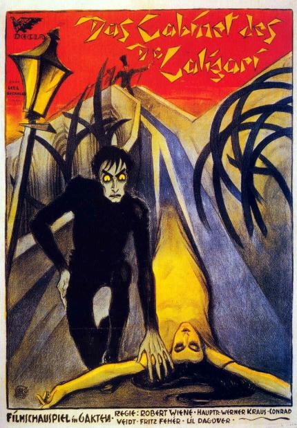
The Cabinet of Dr.Caligari is a German Expressionist film made in 1920, directed by Robert Wiene and stars Werner Krauss as the famous Dr.Caligari and Conrad Veidt as the somnambulist, Cesare.  The films tells the tale of how the mysterious Dr.Caligari’s somnambulist, Cesare wreaked havoc and panic over the town of Holstenwall. Due to the film’s success, a remake was made in 2005.
After its release, the film became famous for its German Expressionist techniques, which at that time was an art expressionist movement which ran during the time before the First World War. Another reason was that during the time, film makers who moved from Germany to Hollywood had developed their own style of film  which had developed through expressionism and had impressed contemporary film makers from elsewhere that they too incorporated this style and technique into their work.

Since it is a silent film, the film uses dialog cards as well as having the characters communicate by the exaggeration of their gestures. The film begins with Francis recalling the events that he experienced that he and his fiancée Jane went through. The story setting began with the annual fair in Holstenwall which he and his friend Alan was attending to see. They walked into Dr. Caligari’s exhibit, which he shows his somnambulist, Cesare and begins to ask about the future.  Ever since Cesare and Dr. Caligari had arrived into Holstenwall, havoc and panic arises as a series of murders are committed mysteriously. However, at the end of the film, we are shown that we are in fact inside the mind of a madman through the use of production design, the name “Dr. Caligari” being appeared in the sky and hypnotic patterns, as mentioned by Dave Taylor, “Cinematically, director Robert Wiene offers one of the first examples of a film narrative where the viewer knows things that the characters in the story do not. We see the crimes and the perpetrator even as Francis cannot.” (Taylor, 2011)
Fig 2 The design setting is made to look distorted and illusion of reality.

The setting of the film is very expressional artistic, with distorted, jagged buildings whit a lot of silhouettes as well as narrowly distorted roads which mainly contains contrasts between light and dark, which is a way to distort reality and links to Francis and Dr.Caligari, complements the distorted mind of both the fantastical Caligari and Francis.” (Fritz, 2011) Silhouettes and hard lighting is often used to exaggerate to depict the distortedness of the world it is set in. The film also contains a lot of it German Expressionist iconography such as melodramatic acting (like Cesare creeping slowly along the walls.) and the use of colours to depict the good and the bad, i.e. black meaning dominant male evil and dark whereas white is depicted as a young innocent woman, as described by Roger Ebert, “The actors inhabit a jagged landscape of sharp angles and tilted walls and windows, staircases climbing crazy diagonals, trees with spiky leaves, grass that looks like knives. These radical distortions immediately set the film apart from all earlier ones, which were based on the camera's innate tendency to record reality.” (Ebert, 2011).  


Fig 3 The black and white colours reflect on the character’s personality along with heavy dark make up.

The film was inspired by a real life sex homicide murder and from one of the writer’s experience of undergoing at the hands of a military psychiatrist. Other film makers have been inspired by this, Albert Hitchcock’s Psycho and most notably Tim Burton with his gothic dark styles, which Cesare quite similarly resembles to Edward in Edward Scissorhands.


List of Illustrations:
Fig 1: Wienne, R (1920) The Cabinet of Dr. Caligari Poster (online):
Fig 2: Wienne, R (1920) The design setting is made to look distorted and illusion of reality (online):

Fig 3: Wienne, R (1920) The black and white colours reflect on the character’s personality along with heavy dark make up. (online):

Bibliography:
Fritz (2011), NEVER A DAY WITHOUT A LINE: The Cabinet of Dr Caligari [Das Kabinet des Dr Caligari] (1920) (online):

Ebert, R (2009), The Cabinet of Dr. Caligari (1920) (online):
  
Taylor,D (2011), Review: "The Cabinet of Dr. Caligari" (1920) (online) :


Wednesday 26 October 2011

Unit 2: Space - AJttCotE- thumbnails 1

Whilst reading the first source material, I've came up with some quick sketches of how the scene would be shown. Though the first image is only quick ones, I decided to develop and come up with something better. 


So looking at the images from my influence map, I've managed to come up with these ideas. The top left image is based on watching the children's TV programme "Wishbone" which briefly tells the story of A Journey to the Centre of the Earth (AJttCotE) after my little sister been watching it and advised me to do so as well, which proved quite helpful in coming up ideas for something that is outside the cave as well the interiors. The other three images are all based on my influence maps, I've also went to include the "wee man" as an indication of the size of the interiors and added colours to it using Photoshop to make it easier to understand.

Original sketch
Photoshop Added

Unit 2: Space- AJttCotE- influence map

Here are my influence maps for designing the caves from inside based on reading the first extract source material. I've decided to look at the different structures of the rock formations with some lava, ice or metal development as well as looking at them from different time eras as mentioned in the source material: Pliocene,Miocene, Devonian, Silurian and Eocene. I've decided to save the Jurassic, Cretaceous, Triassic, Permian and Carboniferous eras for the plantations and for outdoor scenery.


The second influence map is to look at how ice or lava are formed into rocks, again, I have looked at these images by looking at them from different time eras. I'd also went to look at how molten lava and rocks in surreal worlds, like the fire dragon on the top right.


Life Drawing class: Week 6

To start off the lesson, we had a male model doing 2 minute poses for us. This I think I'm getting used to now, but hard to think of what kind of experiment should I take on to sketch these out as I have a habit of reverting back to the way I draw which is bad!

2 Minute sketches- overall

2 minute sketches- close up

2 Minute sketches- close up

2 minute sketches- close up

2 minute sketches- close up

After doing about 15 of these, we went onto drawing them for 30 minutes using the thumb pencil measurement. I find that doing this is beginning to get a bit more easier than last time, though when drawing the right foot, because of the angle he has placed it in made it difficult to draw. But apart from that I was really happy with the result!!


Doing another 30 min drawing, using the same method again, only this time with the model having his back towards me. This was a bit harder to draw with as there is no chin, or neck so I tried  to divide the head slightly half and put where the shoulders meet. This made some slight differences on proportions like the distance of the feet and the length of the lower torso as a whole, but apart from that the outcome still looks good.


Last 2 minute sketches to finish up for the day with the model cleaning up the place and pausing for us to draw.

Unit 2: Space- A Journey to the Centre of the Earth (AJttCotE)

Yay!! New unit today, which is of space. So after the brief and picking a random slip of paper from the box of scary mysteries I've got "Folder 2" which is...A Journey to the Centre of the Earth- by Jules Verne


I haven't seen the film before or read the book, but after watching the 2008 trailer, the landscape scenery is quite wide, with different genres of age like Jurassic era with Avatar setting to it. So more to come!! :D


Thursday 20 October 2011

Unit 1: Anatomy Presentation

Anatomy Presentation

@Phil- PDF blog download not working!! \(>A<)/ PLZ HELP!!

Hi Phil,

sorry its last minute stuff, I wonder is there a way to get around this. I've just managed to get everything uploaded and am trying to downaload the blog into a pdf but its just not working- it just always comes up with this message..


the message that it comes up depresses me... :'(

CD cover art


Thanks Lev for the CD template and for helping with getting the CD sorted, here's my submission disk artwork. I just thought of keeping the purple idea from the OCR and it quite suits the zebra so I just added in some of my sketches and add a slight purple tint to them. ^_^

Hybrids and Me: FINAL IMAGE!!! ^_^


Final Image!! ^_^
  
Final image profile view
 Finally, I have manged to come up with a final image. Using the feedback from classmates and some second and third years, I've decided to combine two image ideas but kept most of the features from one. So started drawing from a silhouette, until the head and shoulders became a difficult thing for me to judge with, then adding in some colours, skins and stripes.
 
Originally, I was about to use the profile view version instead as my final image but thought that it would be better from a near "front" view. 


2 images combine into 1

The Process stages.


Maya: Detective Scene

Finally managed to get this completed!! It was really hard in trying to get the final image sorted because before working onto Photoshop, the image had turned really dark which it was not supposed to. I've retraced back my steps many times but eventually got this sorted!! \(^_^)/


Final image

Wednesday 19 October 2011

Maya: Bottle labeling and shading


Managed to get the bottle labelling and shading done, though whilst in the making, the bottle and cup ended up being the same colour as the liquid and the bottle label disappeared. This took a while to resolve and ended up redoing and retracing most of the steps but managed to get back on track. In the end, the rendering took a lot of time to render but the results turned out well.

Maya- colouring materials robot


Here are some stills that I've made when adding coloured materials onto the robot. I found this quite interesting and fun to do especially playing with the different materials and colour (in particular the glowing one) which looks quite E.T.


Maya: 3,2,1 point lighting

Doing the 1 point light front first with the cinema scene, it wasn't as hard as I thought it would be though the light hitting the background didn't go quite well because it went too bright at first. But in the end I've managed to tone this down. The rear lighting, the green background scenery went really hard as well because the light shining below the door didn't appear at the start and being not exactly sure of what happened or what to do, I've restarted it again. This time it worked!!


Moving onto 2 point lighting this was a bit easier, kinda getting used to the lighting tools and others.

3 Point lighting seemed quite easy to do, adding spot, key and fill lights.


 This time, the spaceship project was pretty fun playing around with coloured lights and everything.


early morning

early morning 2

mid day

night time

horror

sci-fi

fire blaze

And this one I did randomly by clicking on all layers to appear!! :P


Maya: Dice


Final render

Before Render (frames)

I've managed to make dices from Maya on a green surface. It wasn't too hard to do though comparing to the pen and magnifying glass... :D

Life Drawing Class: Week 5

Life drawing class today was pretty good, we did the 2 minute sketches with 17 different model poses. These I think that I'm getting the hang of this drawing a rough sketch of the body then adding in the tones later. I also tried out different methods for drawing like hatching, lines etc but also felt that it can be improved on if I had more time.


After the two minute sketches, we've used the "thumb-pencil" measurement method again to try to get the right proportions. This I am slightly getting used to but found it difficult in making changes to her head and shoulders as the model had her shoulder slightly different height from the other shoulder, making one side of her neck a bit longer than the other. Though with some slight changes made, I felt that this image looks successful.


Again, using the same method and routine, I found it difficult in getting the body proportions right this time because the arms and feet are slightly in the same distance "away" from the body since at first I've drawn the feet straight which made changes to make really hard. Though I feel that I could've improved more on this image if I had more time.


To finish the day off, we did five poses lasting two minutes each. They're not too bad though and I didn't get much time to add in the tones probably due to the tiredness I was in... :(