Friday, 30 March 2012

Maya: Basic Eyes Complete

Basic Eyes complete (also playing around with blink movements and photoshop!! :P)

basic eyes

freaked out

you name it

"I don't like early Mornings...¬_¬"


Maya Mechanical Leg complete


Mechanical Leg complete

Thursday, 29 March 2012

Shots 1 and 2 test


Slightly improved shot one combined with the 360ish view as a test. (not originally on the storyboard) also added in shot 3 to see would it work?? So far I'm really happy with how the camera moves from top to profile shot. The profile cycle still needs some tweeking with the wheels and structure though.

Wednesday, 28 March 2012

Animation Class: Week 3

Continuing last week's lesson on key frames, we did an exercise of where we had to draw one shot that is a summary for each act. Therefore afterwards we were told to draw 6 key frames that are in different angles and movements to show our environments without having the character in except the last 6th key frame. Here I have done this separated in 3 acts. the images above the red lines are the 3 summary shots from each act and below them are the 6 key frames that might help show environment.


Animation Theatre 2: Walt Disney (1901- 1966)

Walt Disney
Walt Disney was a famous American film producer, producer, director, voice actor and animator. Famous for his ways of entertainment during the 20th century, with the help of his brother the two co-founded Walt Disney Productions, now known as The Walt Disney Company.

Disney born in December 5, 1901 in Chicago, USA Walter Disney was raised on a farm in Marceline, Missouri. Disney became interested in drawing at an early age, selling sketches at the age of seven to neighbours. Disney then went to study art and photography at McKinley High School in Chicago in 1890. Walt Disney later went to work for the military services but was rejected due to underage. However he managed to work for the Red Cross which when driving his ambulance it was covered in Disney cartoons instead of camouflage patterns. Later Disney started a small animation studio in 1922 where he and his partner made animated shorts advertising films to local cinemas. Later they did a series of cartoon sketches called Laugh- O- Grams and Alice in Cartoonland, which is a seven minute film comprising live action and animation together. Moving to Hollywood, Disney developed more on his animated cartoons and sketches and created Mickey Mouse in 1928, which also saw Disney creating his first synchronized sound animation, Steamboat Willie (1928).  By the 1930’s Disney began to develop more animated shorts to animated feature length films, notably like Flowers and trees (1932) and Silly Symphonies.
One of Disney’s works, Fantasia 2000 (1999) is a fantasy musical film which orchestrated music is played along with the film to add dynamics and emphasis. Originally made by Walt in the 1940’s, the 2000 version was revived with added shorts by his nephew, Roy. E Disney. The Sorcerer’s Apprentice features Mickey Mouse as an aspiring magician who attempts to recreate the tricks that his master does only to find that he is unable to control them. Though no dialogue is heard in the animation, however music by Paul Dukas is played in the background to exaggerate key points and actions of the film.
The Sorcerer's Apprentice
A segment from the film Pines of Rome involves a family of whales where the calf who loves jumping ends up getting lost after flying through the skies during the northern lights or supernova event. However this was not as successful as the others due to its strange story telling but was praised for its art beauty in IMAX theatres. Here Paul Fischer author for his review on Fantasia 2000 on Crankycritics states that, “The Pines of Rome sequence may be the most beautiful minutes of animation art ever seen on a big screen, and the IMAX projection at which you'll see Fantasia 2000 for the first six months of its run, only enhances the effect.”(Fischer, 2011)

Pines of Rome
Firebird Suite was another segment from the animation. Using only music to help add atmosphere into the story which depicts a Spring sprite befriending an elk after a long winter. The Sprite attempts to restore life to a forest, creating green wherever she goes until the reaches a volcano. This however accidently awakes the Firebird spirit of the volcano and in anger destroys the forest. The sprite is restored to life after being found by the elk and goes forth to restore the forest life once again. Again this segment was praised for its story telling and the art developed, as reviewer, Brian Sibley for BFI Sight and Sound states that, “The spirit of the forest soars across a snowy landscape, bringing new life in the form of a spreading carpet of flowers and greenery, only to confront the explosive force of the volcanic Firebird in a sequence of exquisite beauty and raw natural violence, images of the kind which abounded in the first Fantasia” (Sibley, 1999)
Firebird Suite
Notably Night on Bald Mountain is one of Fantasia’s famous segments. It tells the tale of how every night on Bald Mountain the midnight devil, Chernabog awakens from the tip of the mountain and begins to spread darkness over the nearest town. As he stretches his wings, ghouls, ghosts and other evil spirits arise from the shadows. The evil spirits are seen dancing and flying around the skies until they get driven back by the sound of an Angelus bell, signaling that the sun is about to rise at dawn. Though the piece was successful, it made controversy due to the segment’s darkness which Chernabog could be depicted as the Devil and the angelus bell and the light could be symbolized as Christianity with the music of Ave Maria is played in the background.  Paula Stiles, reviewer of Medieval History explains that, Yet, the initial image of the dead streaming out of their graves in a parody of Judgment Day, the succubi dancing on the Devil's fingers, even the name of the Devil (Chernabog), are medieval concepts in origin, as is the final image at dawn of light-bearing pilgrims chasing away the demons to the amazing voice of Franz Schubert's "Ave Maria" (Hail Mary)” (Stiles, 2006).


Chernabog in Night on Bald Mountain

List of Illustrations:
JOI(2010) Daily Quote: Walt Disney's Four C's(online):
David (2010) David's review of "The Sorcerer's Apprentice" (online):
Disney, W (1940) Pines of Rome (online):
Seiley, J (2000) Fantasia 2000: The Fantasia Anthology DVD Review (online):
http://www.dvdizzy.com/fantasia.html - (accessed on 28/03/2012)
 reverse shot (unknown) A Few Great Pumpkinks IV (2009) (online):
Bibliography:
Fischer, P (2011) Fantasia 2000 (online):
Sibley, B (1999) Fantasia 2000 (online):
Stiles, P (2006) Film Review: Fantasia (online):


Tuesday, 27 March 2012

Life Drawing Class: Week 18

 Today in life drawing class we focused on last weeks topic of Dynamics and movement. This time instead of doing the usual few mins sketches, we did some "key frames" of the model's movement. This was done in eight key frames which the model was mostly in static motion. This started with the model posing from below and up and for the second round, the model is sweeping with a prop in circles.


Next doing pretty much the same with the previous exercise (with the eight frames), we were told to add emphasis on the cloth's creases as the model poses around with it. This again was used for the next exercise which involves the model reaching for the tray and we have to imagine the movement of the water as she "chucks" it out.


the cloth 
tray and imaginary water exercise
We then later did another exercise only similar to last week's exercise, we have to draw inbetweens between to images to show movement. This was done by the model posing in one position (with a cardboard javelin) and the other posing as if she's throwing it. I thought to show this would be ideal to use a red pencil to highlight the movements.

javelin throw
This time, we focused on the dynamics and movement of the model and the cloth. This was done with the model dancing around with the cloth and at some random stages the model was told to stop. At this point we have to draw the model in rough shape for 30 secs before continuing. Again, to show this I thought it would be better to show the movement in a different colour. This worked best as although it looks messy but it separates between model and cloth and pretty much forming a shape. This exercise was done again for the second round. 


Next we did some more of images in movement. Mark showed us an image of how movement is recorded in image form which shows small trails of action leading from one to the next, similar to Pas De Deux. This involved the model walking, then getting frightened before running off. The second round involved the model pretending to lift weights before lifting them into the air and the third round has the model walking around with a few props under her arms. Again, using the red colour I've added emphasis on the movement (like lines) or added in betweens in red colour.

walk, frightened and run
walking and lifting


Sunday, 25 March 2012

Myopic Penny Farthing cycle test

Here is my myopic penny farthing cycle test. I've first decided to focus on how the wheels would cycle since there'll be a single dent in each wheel. To do this, I've built a replica of it using Plasticine (which unfortunately turned into a dodgy colour from unit 2's mushroom colour mashup!! :S) and have used stop motion to recreate how the wheel would look and move. This gave me a rough idea and so I have drawn out a rough cycle run of the penny farthing. I've then reused my tricycle from Unit 3's uncanny (since its the closest to being a bike) and added a camera to create a shot to my opening sequence of my animation. Though its a bit fast but I thought about adding a shot to show depth and the surroundings easier in a 360ish way. This is something that I hope to use and recreate hand drawn and combine it with this test cycle.

Penny Farthing cycle test

The shot which I hope to combine with the test shot

My plasticine test shot


The cycle guide I've created and used

Saturday, 24 March 2012

Animation Theatre 2: Norman McLaren (1914-1987)


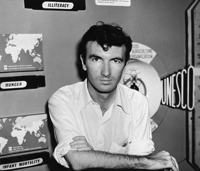
Norman McLaren on his return from China in 1950, at Unesco headquarters in Paris.
Norman McLaren
Norman McLaren (11 April 1914 – 27 January 1987) is a Scottish, Canadian animator and film director famous for his works on visual music, drawn on film animation and abstract films.

McLaren studied in Glasgow School of Fine Art; however his fascination with dance and film led him to join the school’s Kine Society. There he made his earliest film documentary, Seven Till Five (1933 and even developed more of his interest in film making and techniques. After graduating, he began working under John Grierson, there he created his film Love on the Wing (1937) which he also gained interested and began using the technique of drawing directly and scratching on film strip as he did not have access to cameras. In 1939, McLaren immigrated to the United States, where he made several abstract films whilst “dancing” along to the beat of the music, notably Stars and Stripes (1940) and Dots (1940).

One of his works, Lines Horizontal (1962) which involved lines moving around the screen whilst following to the dynamics and rhythm to the jazz music. McLaren used his technique of drawing directly onto the film for this animation and based on his previous film, Lines Vertical (1960), as described by Donald McWilliams, writer of McLaren’s biography for his site, Focus on Animation, states that, “vertical lines only were animated by engraving directly with a stylus and a ruler onto black film; in 1962, these same lines were turned optically 90o to become Lines Horizontal.” (McWilliams,  unknown). 
 
Different frames showing the horizontal lines movement

Another of his famous works, Le Merle (Blackbird) (1958) is based on a French- Canadian folk song, which describes about the creation of the white cutout blackbird on losing and regaining its body parts on a pastel coloured background.  National Film Board of Canada describes McLaren’s animated film, “Norman McLaren imparts unusual activity to an old French-Canadian nonsense song. Simple white cut-outs on pastel backgrounds, many by Evelyn Lambart, provide lively illustrations. The folksong "Mon Merle" is sung in French by the Trio Lyrique of Montréal.” (NFBC, 2010)

Le Merle (Blackbird) (1958)
 McLaren developed the technique of multiple imaging as seen notably in his ballet film, Pas De Deux (1968). Using multiple image layers onto film creates“trail” of the ballet dancer’s previous actions as she begins to fall in love, this technique helps add the emphasis on the dancer’s legs and arms movements as well as emphasizing on the idea of time as she finds her partner. Here, Fosco Lucarelli writer for the post on Socks Studios describes the work on McLaren’s piece. The film sees two performers dancing a Pas De Deux, filmed on high contrast film stock with very stark side lighting. This is augmented by step-and-repeat printing on an optical printer. This gives the film an almost stroboscopic appearance.” (Lucarelli, 2010)


Multi imaging in Pas De Deux (1968)


List of Illustrations:


Taylor, A (1950) Norman McLaren image (online):

Rehn, D (2011) Different frames showing the horizontal lines movement (online):

Jensen, T (2006) Le Merle (Blackbird) (online):

The Movie Doc (2010) Multi imaging in Pas De Deux (1968) (online):

Bibliography:

McWillaims, D (unknown) Norman McLaren: Biography (online): http://www3.nfb.ca/animation/objanim/en/filmmakers/Norman-McLaren/biography.php - (Accessed on 21/03/2012)

NFBC (2010) Le Merle (online):

Lucarelli, R (2010) Pas De Deux by Norman McLaren (online):

Thursday, 22 March 2012

Animation- Gesture Drawings


Animated Myopic man walkcycle

Using the normal walkcycle as a base, I've added the myopic or blind behavior onto my walkcycle man. Since he appears blind or particially blind, I thought it would be a good idea to use a walking stick to see how this would work. Changing the positions of the walking stick ( moving left and right) whilst walking was quite challenging to make, I've also added some emphasis on the stick's landing by adding a few lines as it hits the ground.

Tuesday, 20 March 2012

Life Drawing Class: week 17

Today in life drawing, we focused on Dynamics. This involves movement of the body and how this can be expressed and shown in our work. To start things off, we did the usual 10- 2 mins sketches.


Next we focussed on dynamics and movement. The model did a slowed motion of sweeping the floor, I've decided to go for the method that we're currently using for our Animation workshops with Meg which were to take out the most important poses (the beginning, middle and end). At first I've used and oridinary pencil but decided that it might be best if it were to be in different colours. I've mainly used blue and red colours to differentiate them. We did the same thing for the second round, this time the model walking back and forth and pose for a coouple of seconds. I've used red to show poses on the left and walking to the right and for the blues, pose on the right and walking to the left side of the room. 


Again doing the same thing, this time I've added in a purple to show the inbetweens. Starting with the model twisting side to side using red and blues, then later adding the purple on the lower left as he takes a step up a  ladder. Finally with the last one the model is walking in circles slowly. Again I took the important parts (mainly the front) and one from left, right and behind and coloured this boldly in blue and red. The others are lightly shaded and with reds, blues and purples.


Sunday, 18 March 2012

Animated walk cycle

Here is my animated walk cycle made of 24 frames. I've based the walk cycle from Richard Williams The Animator's Survival Kit. After trying out 3 times I've managed to get this walk cycle walk properly. (This was due to the spacing of the feet between lifting and landing between steps.) I only did a few frame steps before repeating them again only to change the side of the legs and arms.


My walk cycle guide.

Saturday, 17 March 2012

Unit 5: Animation- Storyboards

I've managed to create my storyboard based on my 1st draft of the script. Apologies if it looks a bit confusing as I usually stick post-it shots in some places of what I think should come in before the shots.
Act 1- Scene 1
Act 2- Scene 2

Act 2- Scene 2 (cont.) and Act 3- Scene 3 together
Refined on Photoshop


Friday, 16 March 2012

Animation Class: Week 2

Today, following up from last week's lesson we focused more on gestures. After having some feedback and advice from Animation Meg, she showed me about what a gesture looks after I showed her some of mine. Most of mine were or outlines whereas the best way to understand gestures is to try and draw or scribble a quick image from whats in front or from memory without looking at the page. To warm us up for the day, we did more gesture drawings which this time we start from one pose, then imagine and draw what the model's next pose would be and then finally draw the second pose. Strangely at first some of my guess poses turned out similar to the actual 2nd pose.
Guess guestures and with Animation Meg's gesture example (middle left)
We did more of these before moving onto draw poses in action in particular, sports. We would draw the starting pose of the action and the end pose whilst superimposing on top of the starting image pose.
Poses in action
Next Animation Meg posed for us by sitting on a chair before changing to a old man's pose half sitting on the chair and to a woman standing upright. We've used this as a base for our hand drawn animation where Animation Meg begins from sitting on a chair to standing upright wihtin 6 frames.

Maya: Bipedal Spine and Leg rig complete!! ^_^

Spine and leg rigging complete! :D

Thursday, 15 March 2012

Unit 5: Animation- more Character design :)

Here are more character designs, after talking to Mike, Matt and Shahbir (Apologies if I spelt your name wrong!! :S), they suggested that I look at some rusted bikes and how the frames and wheels would look. So here are a few designs, I thought that I could exaggerate the frame bent and the seat more closely to the handle bars so that from front view it acts as either eyebrows or an old man's hat. Though the face designs look much similar to each other, I'm still trying to find ways to show that its old and partially blind at the same time without bringing in the glasses. Any feedback would be much loved!! ^_^


Wednesday, 14 March 2012

Unit 5: Animation- 10 a day gesture drawings

all 10 a day drawings (since Sat- Wed) in uni and out.


Unit 5: Animation- Script draft 1

Here I have uploaded my script. I'm not sure about naming the title yet but will have a name!! ^_^


Script

I have also included the image and video of the "Goldberg style" plan of how the construction site works whilst the penny farthing is strolling. The plan isn't a neat one, but just to give a rough idea of how it works.


Unit 5: Animation- Character designs 2


Here is some more character designs for my penny farthing. At the minute I am mainly focusing on the "face" as I'm finding it hard to come up with a design to show that its myopic and old without the use of an extra prop added in. I've included one with glasses in but feel that it doesnt quite show hes a happy fellow compared to the other designs due to the glasses covering most of the face.

Animation Class: Week 1

Our first animation class started last Friday with Meg Bisineer. Its really interesting to know that a lot of work is put together to form a few seconds or minute's animation. I was excited and nervous at the same time and I wasn't quite sure was I doing the right thing. To start the lesson we did some interesting drawings of drawing  a scrunched up paper- without lifting off the pencil or looking at what you're drawing!! :O


Later we did some drawing exercises of drawing gestures of people from our class taking in turns doing poses. I did find this hard at the start as I wasn't quite sure on the gestures bit, but I managed to get a rough idea of it. We did more of these for a while until we had to use our character from our unit 5 and "morph" these with a few other classmates to form a sequence of transformations. 


I've teamed up with Lydia and Alice for the sequence and so our characters transform from teapot to penny farthing to a matchbox. 

Life Drawing Class: Week 16

Today, continuing from last week's lesson on expressionism we've also focused on gestures. The whole idea of gestures was still confusing for me to get into grips with but after some advice and reassurance from Tutor Chris it became more clearer. At first I thought it was all to do with shapes or tones but it was all mainly to do with drawing using the arm, letting the arm do most of the drawing rather than the hand. Anyways, to warm things up we did the usual quick sketches ranging from 3mins to 10 secs.


Later, we went on to expressionism. The topic for this round was melancholy and so we can express it in different ways. I went with the toned style and add emphasis on the light and shadows to reflect on this.


Afterwards using the same pose and topic, we had to do a gestured version of this in under a minute. Before discussing with Tutor Chris about gestures, this is what I've drawn. Just a sketchy quick version of the same image.


This time, we had to express Pompous. Because the model had his back to us I thought I can concentrate on the lines. This was when I discussed with Tutor Chris about the gestures, he also suggested that I use tones to emphasize this instead of simple line drawing. 

Next we went to draw/ express Narcoleptic. Again I feel that lined or squiggly tones might help emphasize that the model is sleeping. I've also added some shadow/ tone lines on the outside to show he's sleeping?


Lastly we did the "look down on someone" behavior (Forgot the proper name!! :S) This I thought I could add emphasis on the head and the expressions on the face and arms- also adding tone as well. I think that the face worked quite well.