 |
| Pirates Cove |
Thursday, 26 January 2012
Saturday, 21 January 2012
Unit 3: textures
Friday, 20 January 2012
Unit 3: Environment-Final scene
Not sure are these passes are meant to be the way they shuold turn out as Maya had crashed in the process! :(
At last here's my finished scene after a number of times it kept crashing and restarting!! -_-
 |
| final image without matte painting |
 |
| Beauty pass |
 |
| finished image |
 |
| occlusion pass |
 |
| ZDepth pass |
 |
| matte paitning with frame |
| from behind |
 |
| from the left |
| from the right |
 |
Wire frame and light test
|
|
trike wheels UV Building (top) and floors UV maps |
 |
| Original View |
 |
| floor carpet texture bump map |
| wire frame |
 |
| Final scene |
At last here's my finished scene after a number of times it kept crashing and restarting!! -_-
Thursday, 19 January 2012
Unit 3: Environment- The TRICYCLE!! ^_^
 |
| front |
After lost count of hours, I have finally made the tricycle!! d\(^3^)/b It was quite hard to do as the tricyle that I have included in my concept art there weren't any iamges that were similar to this. So I ended up looking at the structures of the tricycle and how similar would this look to the concept version. There weren't any images of the tricycle taken from the front so I ended up using an image of the back of the tricycle and try to draw the measurements and outlines for the front.
 |
| side |
 |
| back |
 |
| the outlines |
 |
| The tricycle that was based on |
Unit 3: Environment- UV maps
 |
| fig 1- original layout |
 |
| fig 2 .Looking behind and through the back mirror |
 |
| fig 3. left wall |
 |
| fig 4. right wall |
 |
| fig 5. uncanny 1? |
 |
| fig 6.uncanny 2? |
Wednesday, 18 January 2012
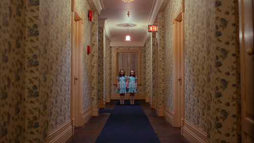
The Shining (1980) Review
 |
| film art |
 |
| The famouse corridor and trike scene |
Set in an isolated hotel during the winter storm, the interior design is mostly filled with patterns, corridors and mirrors that helps create the uncanny feel. “Alive with portent and symbolism, every frame of the film brims with Kubrick's genius for implying psychological purpose in setting: the hotel's tight, sinister labyrinth of corridors; its cold, sterile bathrooms; the lavish, illusionary ballroom.” (Nathan, 2008)
 |
| Twins, patterns and corridors add in the uncanny atmosphere |
To add more of the uncanny effect into the film, it is noticed that at first whilst they travel together in the car to the hotel, Jack appears to be slightly sinister toward his family and by the time they’ve settled in, the relationship between each character appears to be slightly unstable. Having Danny with his “thumb friend” Tony adds to the mystery and suspense of the film especially when coming from a young age the child speaks in a complete different tone to acts as Tony. Though throughout the course of the film, the audience is questioned that are all the characters turned into the madness and this is all made up or reality, “If Danny is a reliable witness, he is witness to specialized visions of his own that may not correspond to what is actually happening in the hotel... That leaves us with a closed-room mystery: In a snowbound hotel, three people descend into versions of madness or psychic terror, and we cannot depend on any of them for an objective view of what happens. It is this elusive open-endedness that makes Kubrick's film so strangely disturbing” (Ebert, 2006). Some even went to say that it was perhaps the hotel that was in control and possessing each of the characters, “The father is gradually possessed by the demonic, desolate hotel.” (Variety, 1980)
List of Illustrations:
Kubrick, S (1980) IMDB- Film art (online):
Kubrick, S (1980) The famouse corridor and trike scene (onilne):
Poselli, A (2008) Twins, patterns and corridors add in the uncanny atmosphere (online):
http://adampolselli.com/2008/01/06/stanley-kubricks-editing-in-the-shining/ - (accessed on 16/01/2012)
Bibliography:
Nathan, I (2008) EMPIRE ESSAY: The Shining (online):
http://www.empireonline.com/reviews/reviewcomplete.asp?FID=132700 - (accessed on 16/01/2012)
Ebert, R (1980) The Shining (1980) (online):
http://rogerebert.suntimes.com/apps/pbcs.dll/article?AID=/20060618/REVIEWS08/606180302 - (accessed on 16/01/2012)
Variety staff (1980) The Shining (online):
http://www.variety.com/review/VE1117794836?refcatid=31 - (accessed on 16/01/2012)
Suspiria (1977) Review
 |
| Film poster |
| The use of red colours at play |
 |
| Use of camera angles and colour made this shot looks repetitive. |
The musical score made by The Goblins was well praised for its scores that suits the
atmosphere of the film and because of their success, they’ve went onto create musical
scores for most of Argento’s films. “The
Goblins' carnivalesque, tribal score amplifies the horror like the roar of fire
leading to a hellmouth, and saturated, bold color schemes permit an
otherworldly tone, like fantasy come to life...” (Projection
booth, 2011).
List
of Illustrations:
Bibliography:
Maslin, J
(1977) The movie climaxes with a
fantastic light show of lysergic apparitions and exploding chandeliers. (Online):
http://movies.nytimes.com/movie/review?res=990CEFDB1F3BE334BC4B52DFBE66838C669EDE&partner=Rotten Tomatoes – (accessed on 29/12/2011)
http://movies.nytimes.com/movie/review?res=990CEFDB1F3BE334BC4B52DFBE66838C669EDE&partner=Rotten Tomatoes – (accessed on 29/12/2011)
Hoberman, J
(2009) Suspiria Shock: Two Runs in
Two Weeks (online): http://www.villagevoice.com/2009-09-01/film/suspiria-shock-two-runs-in-two-weeks/
- (accessed on 29/12/2011)
Projection
Booth (2011) Viewing Log #10 (online):
http://projectionbooth.blogspot.com/2011/06/viewing-log-10.html - (accessed on 30/12/2011)
http://projectionbooth.blogspot.com/2011/06/viewing-log-10.html - (accessed on 30/12/2011)
Subscribe to:
Comments (Atom)


